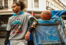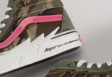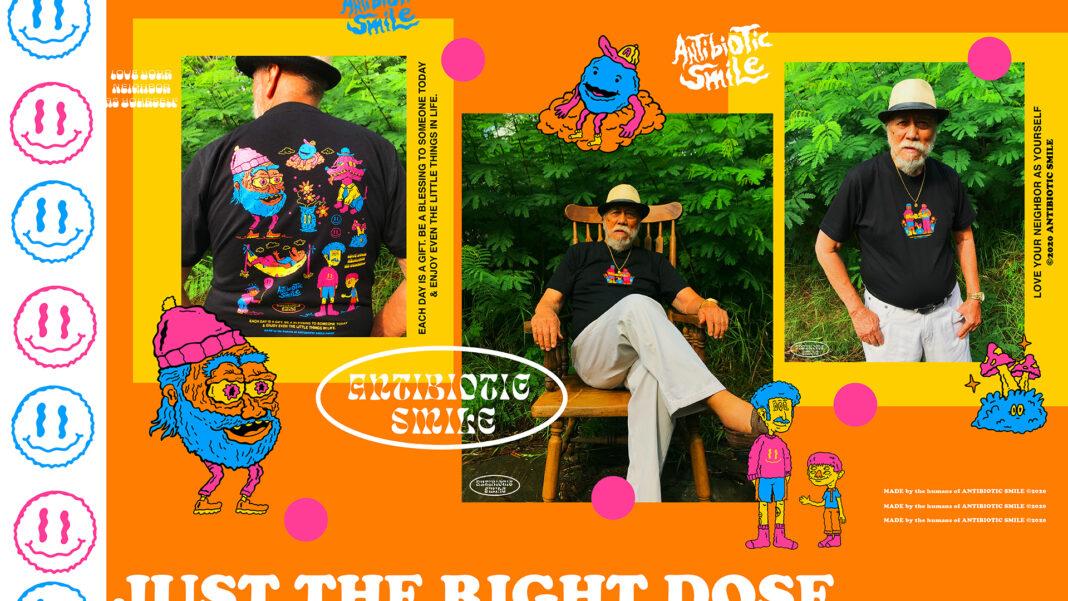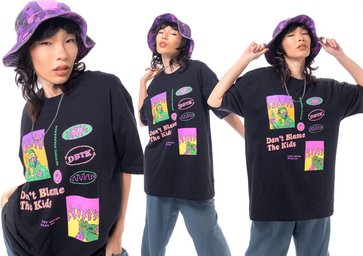
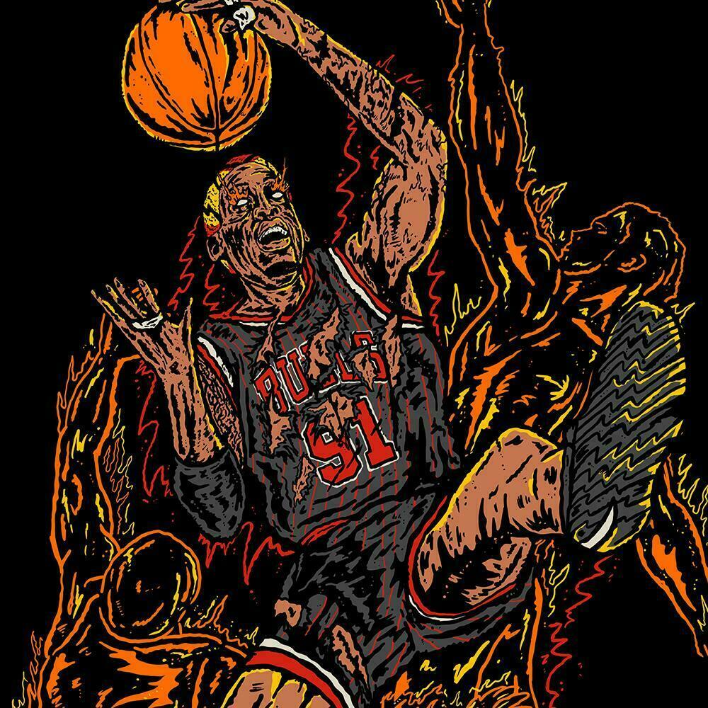
Today’s streetwear landscape has become more and more subtle to the point of having no more room for design. Suddenly, everyone wants simple graphics almost throwing the graphic art element to the wayside. This is where Jethro Olba, artist for DBTK and creator of Antibiotic Smile stands out. He still goes for graphic illustrations and colors like it’s nobody’s business.
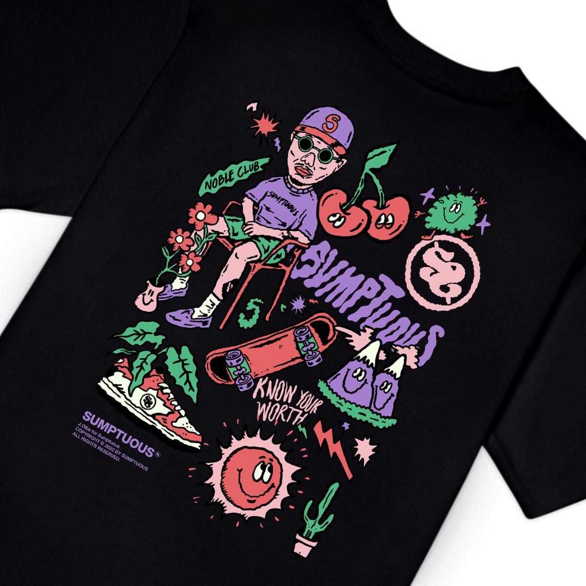
Today, we got ahold of him to tell us more about his art style, his brand and how he got into designing for DBTK. Read on!
First off, how did you get into art for streetwear?
I was first exposed to the creative side of streetwear when I went to Team Manila Graphic Design Studio for my internship in college. Although I was assigned to the branding studio team, I was still influenced by the process and direction of their retail department. I was also beyond grateful during that time because of all the talented designers and artists that guided me to build my portfolio and inspired me to make a
brand someday.

Summer of 2018, I got my first streetwear client work.
It is so memorable because I worked on the illustration while I’m in the hospital’s waiting area because I was accompanying my father in the ICU ward. Pursuing projects were all about survival back then because of the hospital bills. Months later, I tried presenting my young artist portfolio to different local clothing brands to gain experience. Fortunately, one of the first respondents was Sir Vince Javier of Don’t Blame The Kids.
Our first project was the DBTK x Bratpack collaboration piece and I was blessed enough to showcase my art style in that project by illustrating aliens and weird gooey creatures. I had fun and felt that genuine joy. That project with DBTK kickstarted my streetwear art career, landed many projects throughout the years, and made me eager to create my brand.
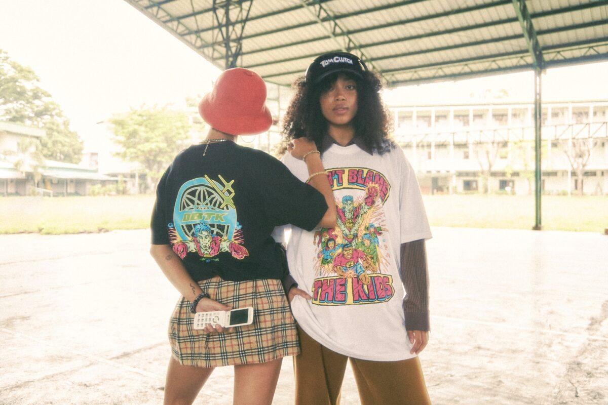
In creating graphics for Antibiotic Smile and DBTK, how do you differentiate the two when it comes to art style? Is there a differentiation?
I was blessed enough that most of the illustration projects that I handled including DBTK are always about involving my art style which is consistently inspired by classic cartoons and comics.
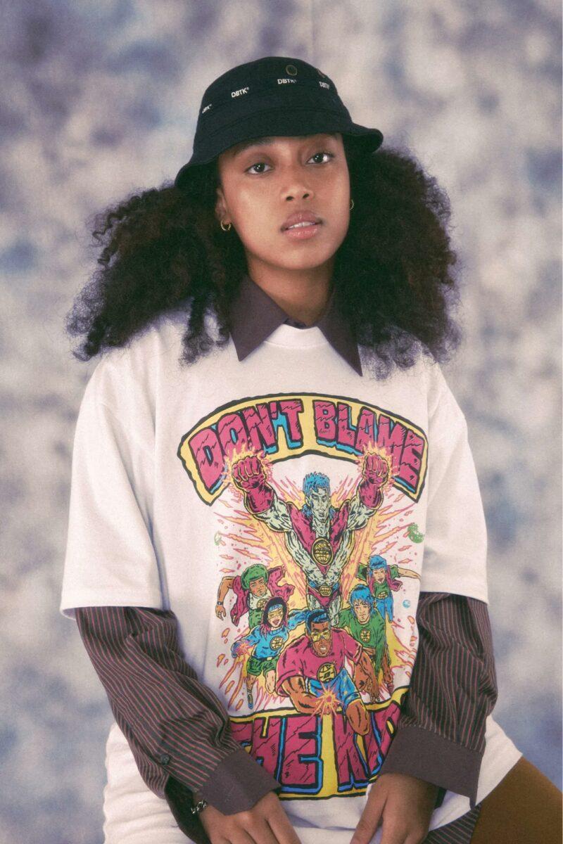
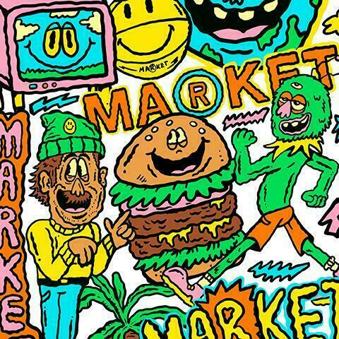
In connection to that, Antibiotic Smile is always about the concept of nostalgia and simply promoting happiness. On creating materials and graphics for my brand, I always consider those things and make sure everything is presented genuinely. Nevertheless, it’s about how I can make each illustration unique on its own.
Who are your art influences? Who inspires you?
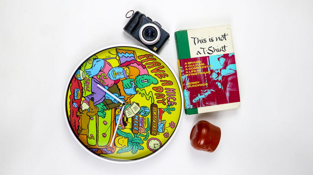
My art style is defined to be jagged, distorted, and vibrant. I always assumed that it is the product of all the things that inspire and I credit it to all the things that I consumed when I was a kid such as the classic cartoon shows, wrestling t-shirts, comics, action figure packaging, and everything nostalgic. My art heroes are always the works of Rai Cruz, Nicolo Nimor, Pancho Karambola, Gigzilla, Takashi Murakami, and Ron English to name a few. But most importantly my real art hero is my mom. She technically taught me how to draw and explore this creative space.
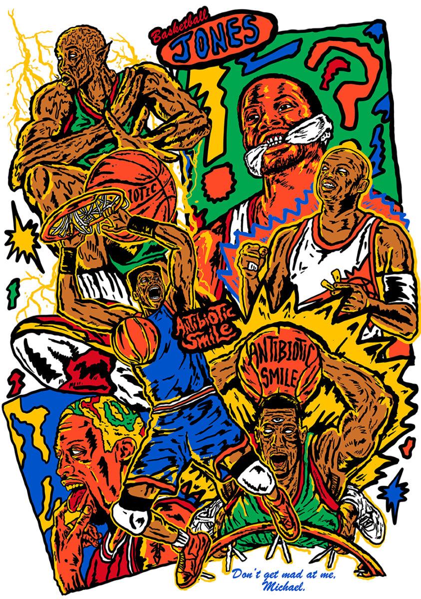
Considering other brands have already toned down their designs, how do you keep your loud style timely and interesting?
I always believe in the notion of “Timeless should have a quality of being universally recognized–even if interpretation among different people varies.” It is undeniable that some streetwear brands are transitioning to a minimal and cleaner design direction and I think it is great. However, I still try to adapt by not making my illustration style limited. Some solutions are exploring typography and creating minimal line art illustrations. Adapting is always a key factor for me as an artist who handles different brands that have their unique directions.
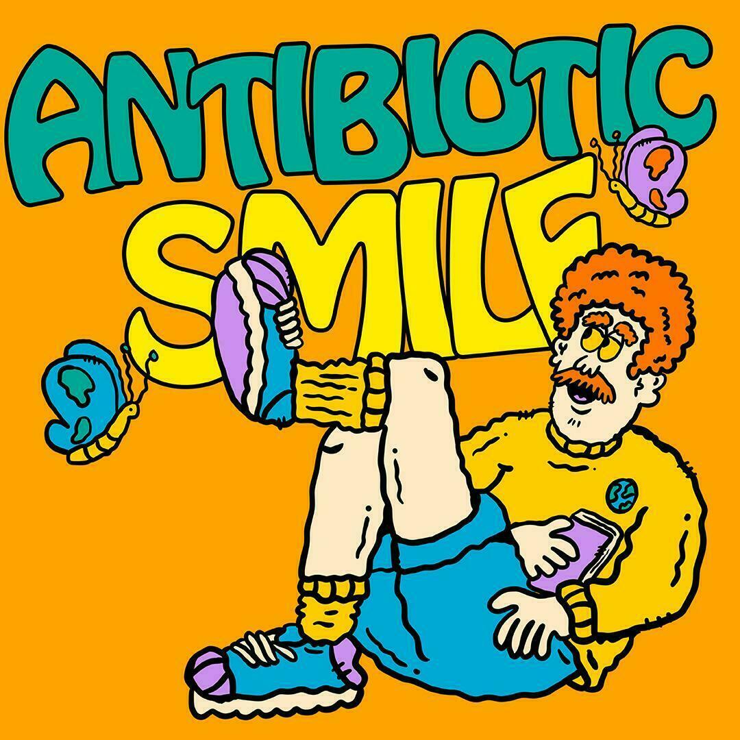
Tell us more about your design process. How do you create a project?
My design process for Antibiotic Smile always starts with creating a brief. By this phase, we can determine what will be the ideal concept we want for the collection. After that, I will prepare a straightforward mood board with all my plans for the design execution that we desire to translate into products.
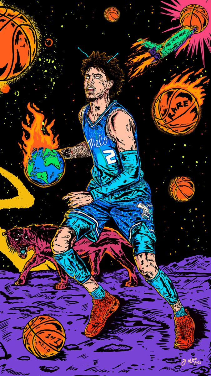
The next step is creating some sketch studies to explore all the possibilities. Lastly is the actual design render and some sample mockups to see its presentation to the audience. It is just a basic design process, but I believe it is effective and efficient.
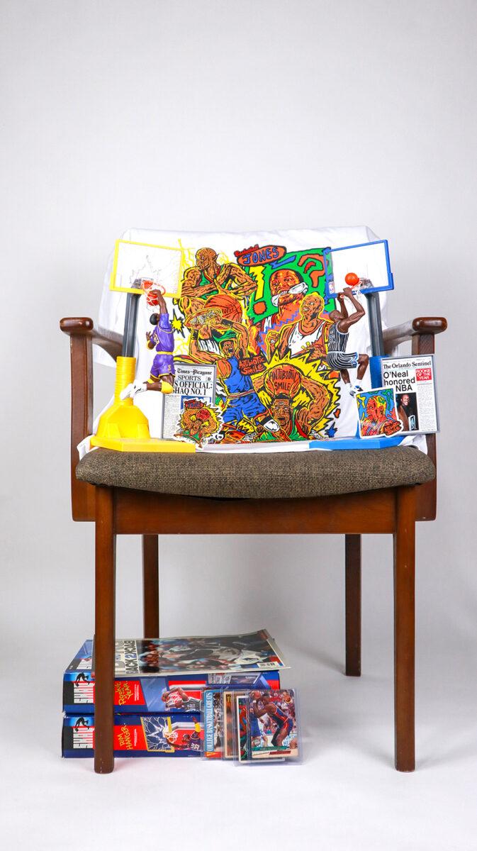
Among today’s trends in streetwear, what is it that you gravitate to?
I am always a fan of maximalist and illustrative streetwear brands. I treat them as wearable art pieces which makes me appreciate them even more. I just enjoyed its intricate details and was fascinated by the story behind it. Even though brands are transitioning into minimal and toned-down designs, I still believe illustrative and graphical streetwear is always here to stay.
Can you share with us what you’ve learned so far in running your brand and designing for an established brand?
For Antibiotic Smile, I learned that consistently being inspired by the things that you like is a helpful mindset to avoid burnout and art block.
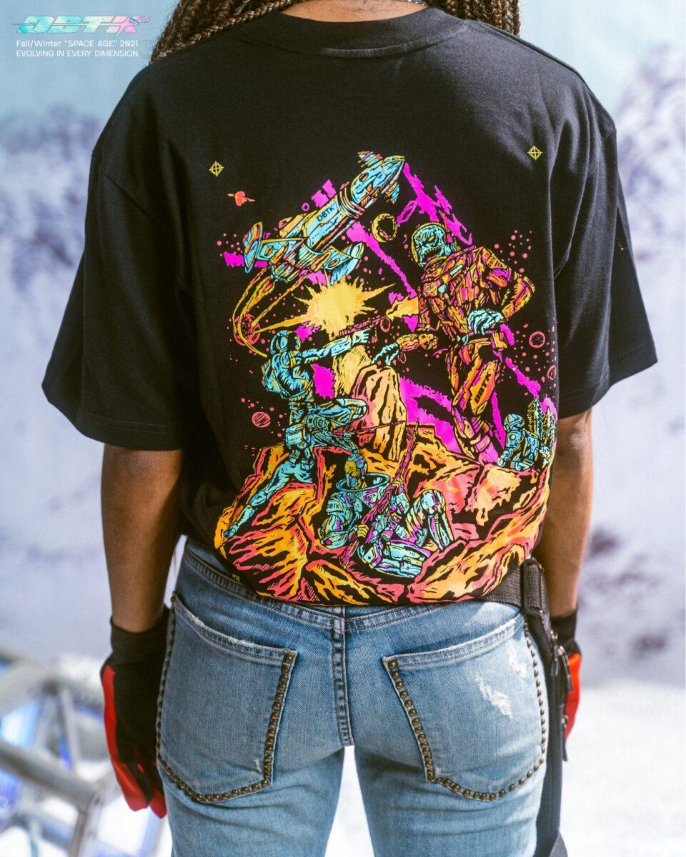
When it comes to designing for other brands, we should always value time and their investment. Make sure you give your best, be kind and build friendships. In this way, the project will become more enjoyable and special.
Word to our readers…
Be brave about what you are doing. Being creative in the streetwear space during this time is not only about the output but rather about the enjoyable process of creating. Always think that you are in a state of play while doing your piece. Embrace the beauty of its imperfection and most importantly believe in your work.
Thanks Jethro! Do check out the rest of his works here.
Another local artist making waves this time in the international comic industry is Harvey Tolibao. Read more about him here.


